We usually tend to have a very simplistic vision of the bathrooms and we think it must be functional and that’s all.
In my opinion, the bathroom is a room to be treated just like any other, it must be warm, relaxing and impose a certain atmosphere, after all, the French call it "salle de bain" for a reason.
My advice for you is to overcome the barriers imposed by preconceived ideas, such as a bath must have all the walls coverd with tile, or the flint must be identical to the tile to fit, as the easiest way is to make everything beige!
To detail, I will lead you through 3 different bathroom rooms, all located in the same house, which does not follow any of this rules!
1. The white pearl
One of the barriers we are talking about above is that a white bathroom looks like "a hospital bath," or a bath in the communist era.
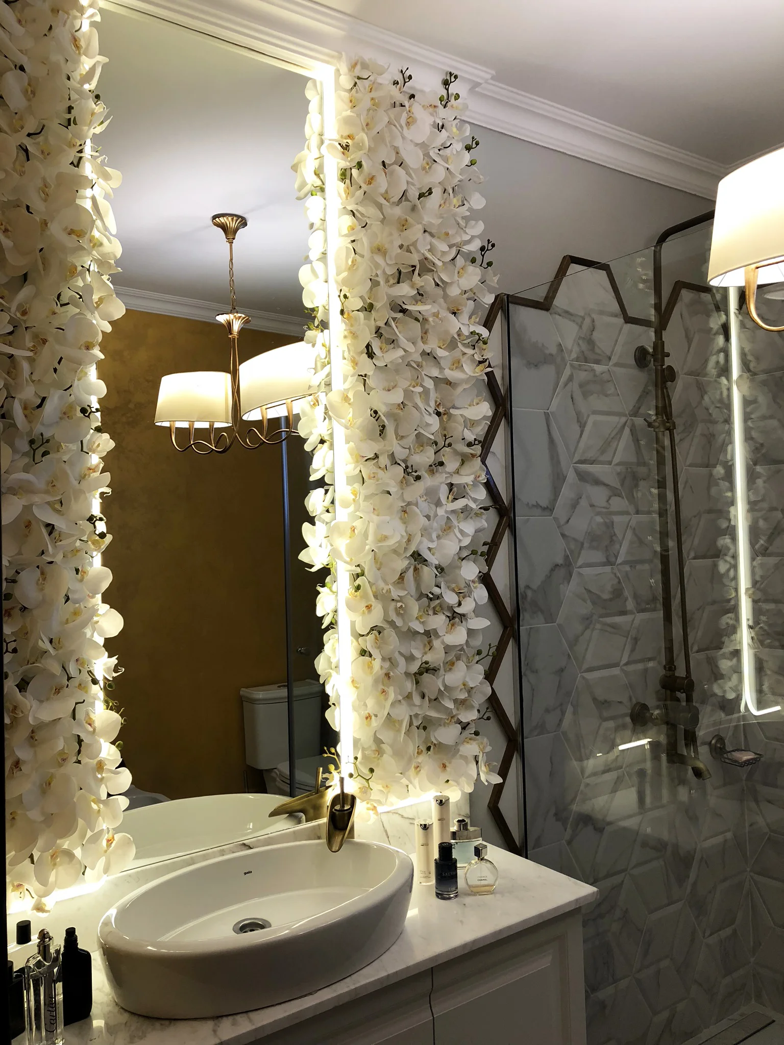
The bathroom I am presenting to you today is a statement of elegance! sophisticated and mysterious, with a white plywood with 3D shapes in the shower area, which continues almost inexpensively in the floor area with the same plywood model in a flat version, both white in color with a carrara marble pattern.
The plywood used in the shower has a hexagonal shape, which is why we did not want the delimitation lines of the shower area to be straight, as this would have completely destroyed the asymmetric effect, which is why we left the corners of the plates out of the glass. To give it more personality, I created a wooden edge that makes the transition between the wall and the tile.
In the rest of the room, the walls have been finished with a textured, golden-colored bath paint, so that the room emits warmth and a sense of mystery.
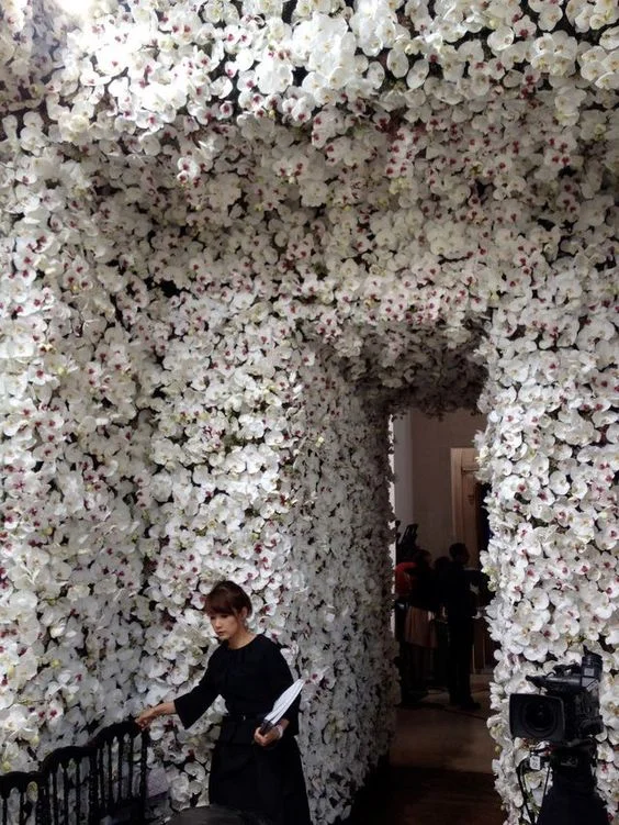
The washroom area is inspired by a Dior show, in which the flowers were the central element and turned the space into a lush garden. I chose to fit the mirror with two panels of white orchids, which I personally made and arrange them piece by piece in the panels created specifically for this construction.
To create the illusion of depth, I placed the led strip between the orchid panels and the mirror, so when you look in to the mirror, “you escape” for a moment the place you are in, and walk into a magical and lush area.
Despite the fact that ceramic plywood has a modern line, for furniture we chose a classic style, more precisely we made a single masonry board that we cut it so that it becomes 3 doors that together form a unitary image. As a top we used white carrara marble, with a 10 cm curvature on the wall to protect the wall but also to give it a finished look.
The ceramic washbasin has an oval shape, which makes it more interesting to place the battery sideways so it looks like a decoration object. The battery is spectacular, with a matte gold finish, and the water that flows in the form of a cascade directly under its handle.
The chandeliers are among my favorite accessories, and for this bath I chose a typical Art Nouveau piece with golden curved lines and two white shades that illuminate the room nicely.
And for the whole ambience to be complete, I covered the window with a pale blue curtain with gold inserts, placed on a classic gallery and trapped in the side to be draped.
2. French Colony
Another preconceived idea is that the tile and faience must be "matched" or part of the same collection, the rule that we vehemently "violated" in the concept of this bath.
The idea that inspired me was once again the colonial style, the combination of very sophisticated French elements and vibrant African colors, so I placed a crystal chandelier and a bath tube in a yellow décor!
The floor covering has the appearance of an old, painted wood, whose colors have gradually disappeared with the passage of time, and so reeks the atmosphere of colonial times nowadays.
The walls are covered with a yellow honey-colored plywood with a wavy shape that forms a play of lights and shadows and is highlighted by the gray lash and the gray painted area above it, again bounded by a wooden element.
The idea of combining yellow with gray came to me when I was reading a book about the Arts and Crafts period, and the author remembered the combination of "honey and ash", which for me was a revelation and I realized that I had to use this unique combination of totally divergent elements and colors both palette and as feeling expressed.
The front wall of the entrance is covered with a mosaic in the shape of a tear, the color of the cognac that tempers the yellow and brings a little calm in the room.
And so i've used 3 completely different types of plywood from different collections and stores that together create a story and give you the chance to sit down and dream openly to a totally different culture from what you know now.
The bathtub was purchased with shiny silver legs, which did not seem right at all in this context, which is why I turned again to my talented collaborator who painted the feet in a gorgeous matte black and so I got the perfect tub.
The balance in this bath room is given by the details, the crystal chandelier, the exotic green plants, the wooden demarcation line that highlights both the yellow ceramic tiles and the gray on the wall and, last but not least, the crownmolding.
3. Welcome to the forest
The service bath does not have to follow the same rules as a normal bath, so it is not absolutely necessary to use ceramic tiles from my point of view!
The walls of this bathroom want to recreate a glazed wall that separates the bathroom from a lush forest, so when you walk into the bathroom you feel like you have a direct connection to the outside space.
In fact, this element was also a tactic to create the illusion that the bathroom would be bigger than it actually is in reality and give the feeling of airy space.
The rest of the walls have been covered with golden decorative paint to remain in a sophisticated area and the floor is covered with a matte and glossy black mosaic that takes light in an absolutely gorgeous way.
As accessories I chose a wooden console that resembles an old trunk placed on high legs, two white carved wooden mirrors and a luster with a stylized shape of the sphere


